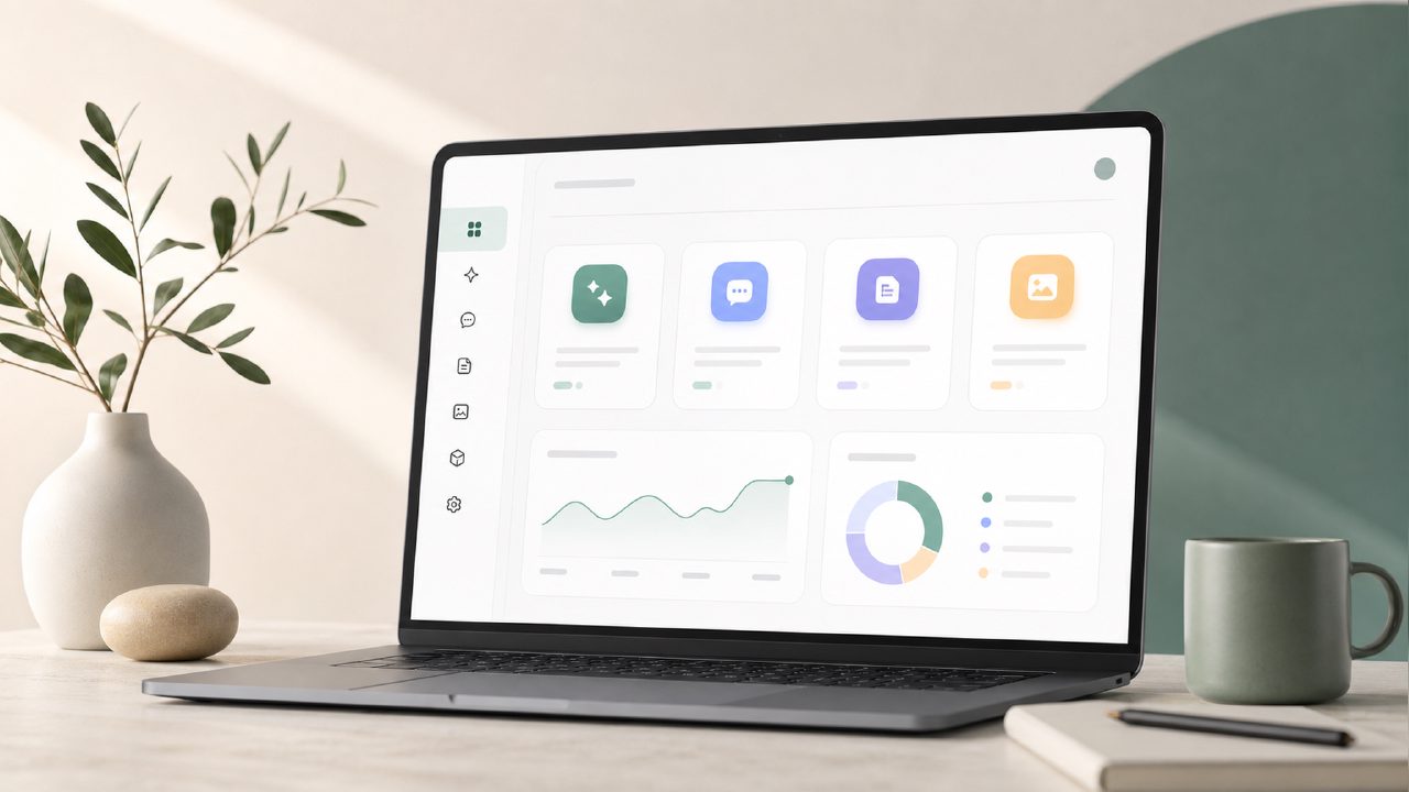
I’ve been testing zaso.ai’s Dashboard for a couple of weeks now, mostly because I was burned out by bloated productivity apps that try to do everything and end up doing nothing well. zaso pitches itself as six small AI tools, each focused on one thing — not a Super App. The Dashboard is where you land and orchestrate them. I wanted to see if that focus actually held up in daily use or if it just felt like a stripped-down version of something bigger.
First impression: sparse but intentional
When you open the Dashboard, it’s not crowded. There’s a clean list of the six tools plus a central feed that shows recent activity. No onboarding wizard, no tutorial pop-ups. That might throw off someone expecting hand-holding, but I actually appreciated being left alone to click around. The layout makes it obvious what’s a tool and what’s just output. The tools are labeled plainly: Assistant, Daily Planning, Digital Journal, and so on.
One concrete thing I noticed: the Assistant tool lives right on the Dashboard as a chat bar, so you can ask questions without navigating away. That sounds minor, but it saved me maybe three clicks per session. Over a week, that adds up.
Where the Dashboard shines and stumbles
The feature I found most useful was how the Dashboard surfaces recent entries from the Digital Journal and Daily Planning tools in a single timeline. It gives you a quick snapshot of what you wrote yesterday and what’s scheduled for today. That feels like a real Productivity System without forcing you into a rigid method. You can ignore it or lean into it.
But there’s a friction point: the Dashboard doesn’t let you rearrange or hide tool modules. If you never use the Life Management tool (I barely did), it still sits there taking up vertical space. You can scroll past it, but on a small laptop screen it felt slightly wasteful. A customizable layout would make this feel more like a real Personal Knowledge hub rather than a fixed list.
Another observation: the Workflow Management tool isn’t on the Dashboard itself — it’s deeper inside one of the tools. That’s a design choice I’m still unsure about. The Dashboard feels more like a status board than a command center. For quick reviews it’s fine, but for actual routing of tasks you have to drill in.
Is it for you?
I think this Dashboard works best if you already have a habit of logging thoughts or planning your day, and you want a lightweight way to keep those streams visible. It’s less suited if you need heavy Automation triggers or cross-tool dependencies — that’s just not the design philosophy here. The Assistant tool can answer questions and pull from your entries, but it didn’t proactively suggest actions or relationships the way some smarter systems try to. That’s perhaps a limitation, but also a relief if you don’t want a tool that second-guesses you.
One tradeoff that became clear: because each tool is separate, there’s no single search across all of them from the Dashboard. You have to open each tool to search its content. That broke my flow a couple times when I was looking for an old note I vaguely remembered writing about Life Management scheduling. I found it, but not from the Dashboard itself.
Final thoughts
The Dashboard doesn’t try to impress you with data visualizations or AI-generated summaries of your week — which some might miss. But it also doesn’t get in your way. After two weeks, I’m keeping it as a Daily Planning starting screen. It’s not a perfect command center, but it does one thing well: show you what you’ve been doing without making you hunt for it.
Comments
Leave a Comment